

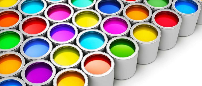
Following the great response to our Spring Colour Palettes article, we've created 12 original Summer Colour Palettes. These are ideal for projects the sunshine has inspired you to start. Whether you're creating a new you through hair and makeup, choosing outfits for a holiday, or decorating a room, at least one of our palettes is going to help - at least as a starting point.
If you're new to colour palettes or colour psychology, there's some useful reading at the end. It includes our simple, practical tips on how to use colour palettes in practice without getting overwhelmed. There's also some further reading if you want to understand colour theory and psychology better.
Summer is a season for . . .
Bright, juicy colours, sunshine & laughter
Lime green lawns, barbecues & baking hot days
Relaxing holidays, people-watching over pastries & coffee
Happy rain, bright umbrellas & wellies
Fragrant flowers & intense tropical fruit flavours
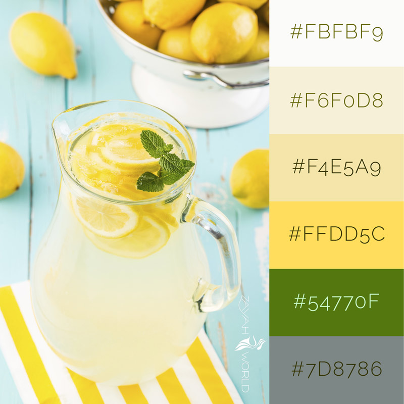
Palette 1: Hot Summers Day
The first of our summer colour palettes is based on this classic summer image of freshly-made lemonade.
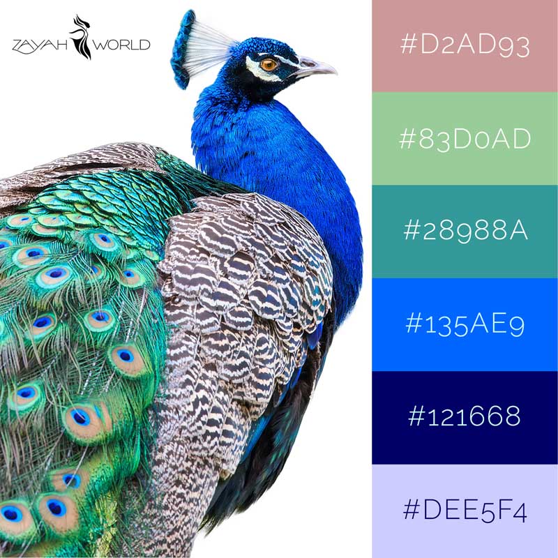
Palette 2: Bold & Beautiful
If you're after a look that's more striking, this peacock-inspired palette is one to consider.
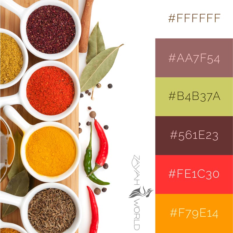
Palette 3: Spicy Warm
Hot and spicy - is that the kind of summer you're in the mood for?
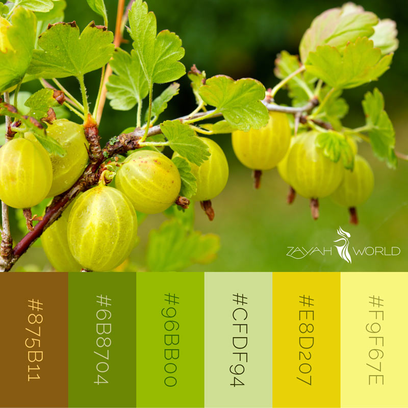
Palette 4: Tangy Delights
Behind their gentle, tasteful green, gooseberries surprise with a sharp, tangy flavour. The 4th of our summer colour palettes is designed to convey that combination visually.
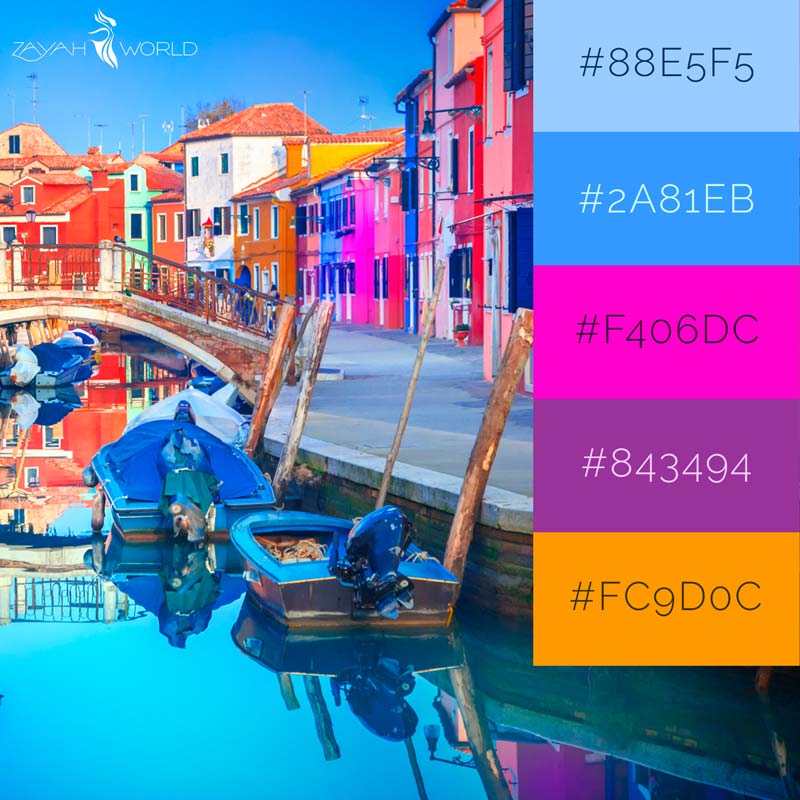
Palette 5: Glorious Venice
This vivid scene from one of our favourite summer holiday destinations led us to a mix of strong blues and pinky-purples, with a dash of glorious orange if you want to add a brave accent.
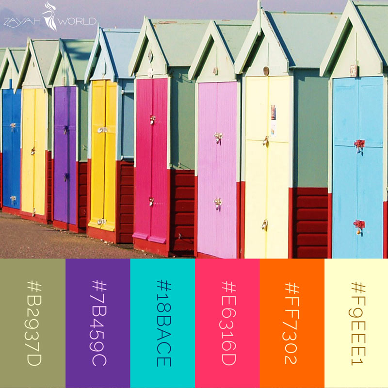
Palette 6: Colourful Beaches
We didn't have any particular type of project in mind when putting together this palette, but we like the colour combinations so much, we're thinking about creating a project so we have an excuse to use it!
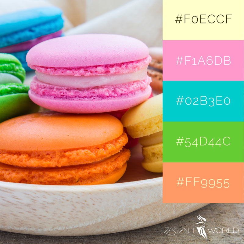
Palette 7: Cheerful Macaroons
If you're familiar with British TV, you probably know that programmes like The Great British Bakeoff and Masterchef have changed attitudes to experimenting in the kitchen, and opened people's eyes to how spectacular food can look. Consider this palette our tribute to Mary Berry.
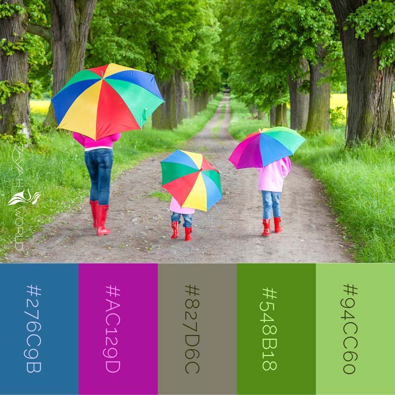
Palette 8: Rainbow Avenue
In the summer, even a rainy day can be fun - there's a lushness to the scenery that's missing at other times. And if you pick the right umbrellas, you have the inspiration for another of our Summer Colour Palettes.
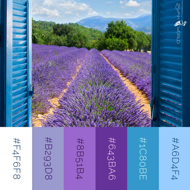
Palette 9: Heavenly Fragrance
One reason we love the summer is the gorgeous smells absent from the other seasons. This palette is our attempt to represent one of our favourite summer fragrances with colour combinations.
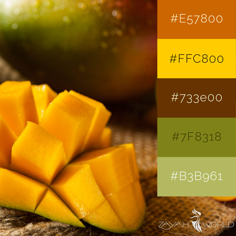
Palette 10. Juicy Delight
Mangoes are great all year round, but they're especially tempting on sunny days. Did you know there are around 1,000 varieties of this sumptuous fruit? Here's a palette based on one of its most familiar forms.
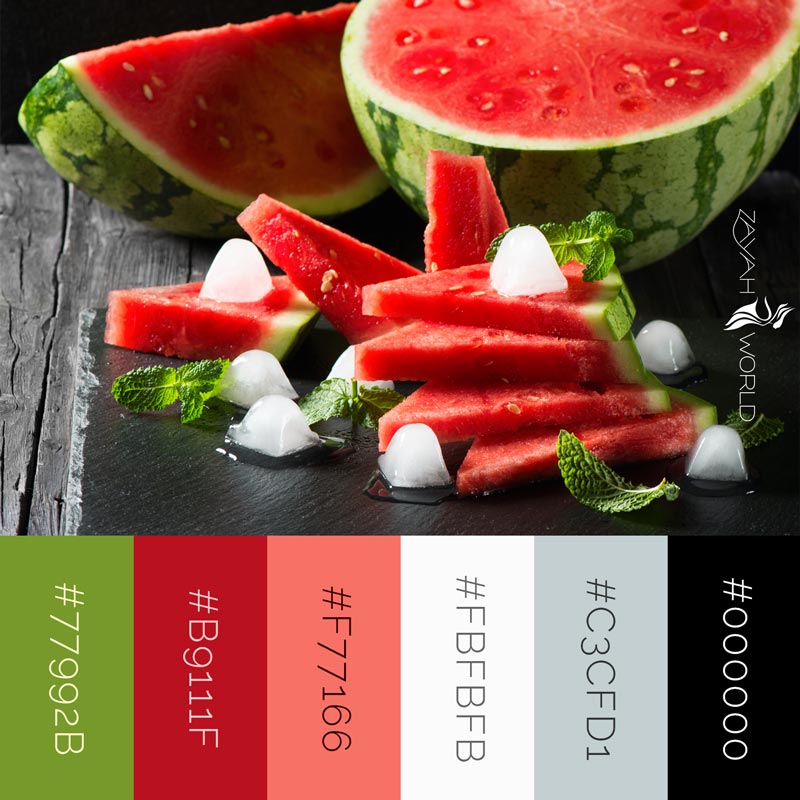
Palette 11: Refreshing Watermelon
If you asked people to name one fruit that reminds them of summer, we're sure watermelon would be up near the top of the list of answers. This colour palette is built around refreshing watermelon red.
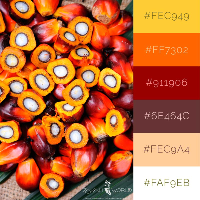
Palette 12: Desert Hot
Do you know what these are? If you guessed some kind of exotic fruit, you're close but not quite right. They're palm oil seeds, some sliced to expose the white kernel. For us, the association is with dry, hot tropical weather.
How to Use Our Summer Colour Palettes
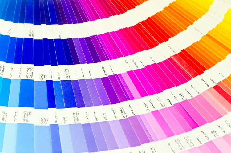
If you want to find out about colour palettes, especially the theory behind them, be ready for heaps of jargon, much of it steeped in science, some the language of colour theory. If you see references to CMYK, RGB, hex and HSL, don't panic . . .
Our advice is to broadly ignore the jargon.
Use our Summer Colour Palettes (and any others you find) to explore colour combinations you wouldn't usually consider, as well as those you would.
Then use your eyes to choose what looks good to you, regardless of what others say.
Here's a recap of our tips on how to look at colour palettes to explore colour combinations, and discover new ones to try out in your next project.
Don't Use Too Many Colours, 3-4 Is Enough
Firstly we'd suggest you don't use all the colours in any of our Summer colour palettes unless there's enough space for each colour to be seen - for example a large room when all the colours can be used, even if only as little flashes. Otherwise, it's usually better to restrict yourself to 3 or perhaps 4 of your favourite colours from one of the spring colour palettes that appeals most, and only work with them.
Be Aware of How a Colour Makes You Feel
In terms of selecting the right 3 or 4, our advice is to use your judgement by simply looking at what you're considering, and paying attention to how they make you feel. We've found it best to think beforehand of the words you want to feel from the final result, for example happy, serious, elegant, moody.
Try Letting Different Colours Take the Lead
You'll find that a set of 3-4 of the colours we've provided in each of our summer colour palettes will help you get to that mood. For instance, Refreshing Watermelon could be used to create an elegant black outfit with reds and greens for accessories. Alternatively, changing to a predominantly white outfit with the same accessories would create a fresh, clean look from the same palette.
Don't Make Decisions Based on Colour Swatches
Finally, wherever possible, don't choose colours by only looking at summer colour palettes in the form of colour swatches. Instead, pick real items of the colours which you can to look at in combination. For example, tester pots of paint on a wall at home rather than relying on the labels on paint tins in the shop.
More Help Using Summer Colour Palettes
If you fancy reading something about combining colours, here are some good starting points:
The Basics of Colour Theory
Here's a great Youtube video that explains the basics of colour theory.
The US Government has published a useful guide to the basic concepts of colour theory, including the different ways of defining a colour e.g. RGB, CMYK etc
Using Accent Colours in the Home
The BBC has published this useful piece on interiors, and this link takes you straight to a useful section on how to use accent colours when looking at colours in the home
Colour Theory for Your Wardrobe
The folks at Lifehacker.com have looked at colour theory in the context of personal style.
Colour and Emotions
Here's some interesting reading on the psychology of colour
How You See Colour
Sometimes our choice of colours is limited by the medium we're using - for example paints can show far more subtle variations than a computer screen. But ultimately we're limited to what the eye is capable of discerning. It's worth taking a look at this article on how many colours the human eye can see.
Found this useful? Don't forget to share it!