

15 Colour Palettes for Spring Inspiration
We've created 15 original Spring Colour Palettes to inspire any projects you're starting that involve colour - everything from clothes and makeup to home decor or work. If you're new to colour palettes and colour psychology, we've also provided some simple tips on how to use them without getting overwhelmed.
A Time for New Starts, New Ideas - and New Colours
The beginning of sunnier days and light in the evenings is a turning point in the year. We can feel the cold and gloom fading away, and look ahead with hope and optimism for the best months of the year.
It's a time of new starts, approaching familiar tasks with new energy and dusting off the great ideas whose time has finally come. Which means it's a time to start new projects.
For many of us, clearing out the wardrobe is cathartic, and the spring sales are a great reason to create a new look. For others it's time to be adventurous with the home, redecorating and remodelling. If you're in the creative industries, clients may well be open to new ideas, and even if you're not, many businesses put their foot back on the gas from April, releasing budget for new initiatives.
For projects with a visual element, our 15 Spring colour palettes provide inspiration for colours to explore.
The Purpose of Colour, the Power of Palettes
Colour is one of the most powerful signals that we're entering a new season, and is one of the easiest ways of sharing how we're feeling with the world around us.
If you know colour psychology, or even if you don't, you'll know that a change of colour in what you wear or your surroundings can make a big difference to how you feel. But for many of us, the colours around us just happen, and we don't necessarily think about how they influence us, nor how we can control them.
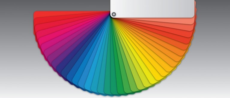
This year, how about planning the colours in your life a little more than usual? We've put together 15 sets of colours that you might not have thought of using, each inspired by a picture from the time of year. Each of our Spring Colour Palettes includes 5 or 6 colours that can be used in different ways.
Because using colour palettes isn't something everyone is familiar with, we've also given you a few references to what they are, how they can be used, and tools to help you create your own. Our Spring colour palettes use the "hex code" for each colour, one of the standard ways of defining a colour uniquely. We've included references to places that will help you translate these codes if the hex code isn't enough for your situation. But usually, you'll find your eyes are all you'll need.
Later in the year we'll be publishing a more detailed guide to colour theory and using colour palettes, and take you behind the scenes on how we create our own from scratch. If you'd be interested in seeing this when it's out, sign up to Zayah World, and we'll let you know about new articles, so you won't miss it.
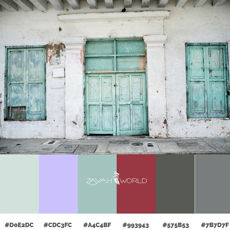
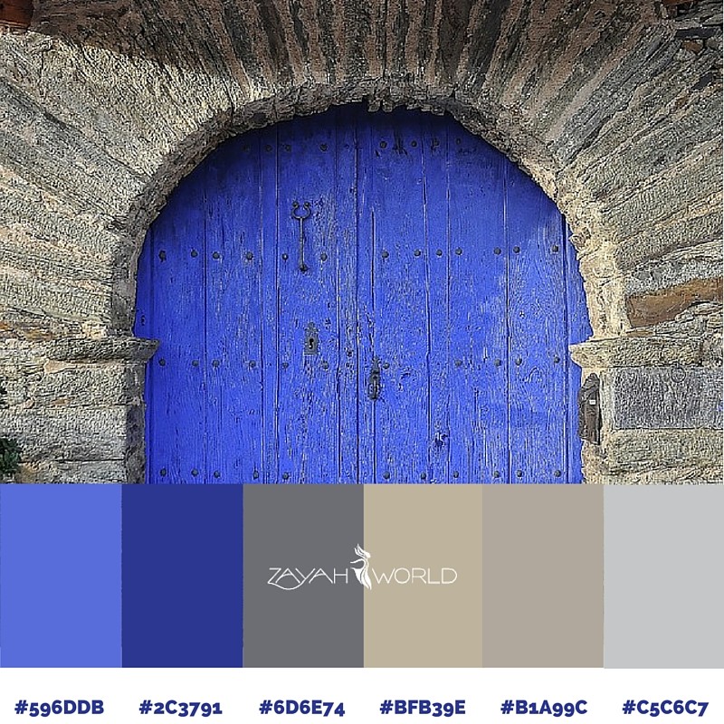
Palette 1: The Tranquil Door
Recent trends in web design ("flat" design) have gone hand in hand with bold and bright colours. Several of our Spring colour palettes show that a well matched set of subtler colours can look good, regardless of the fashion of the day.
The first of our Spring colour palettes has been constructed around a rustic door scene, and kept the sense of tranquility that the slightly aquatic shade of blue evokes.
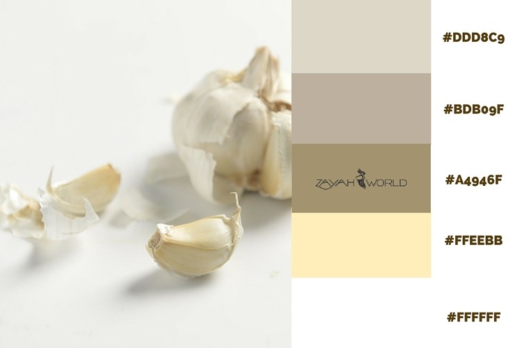
Palette 2: The Useful Pod
Have you ever looked carefully at a bulb of garlic? If not, you'd be surprised by the range of shades and textures to be found in the unpeeled cloves, especially if they're a few days old.
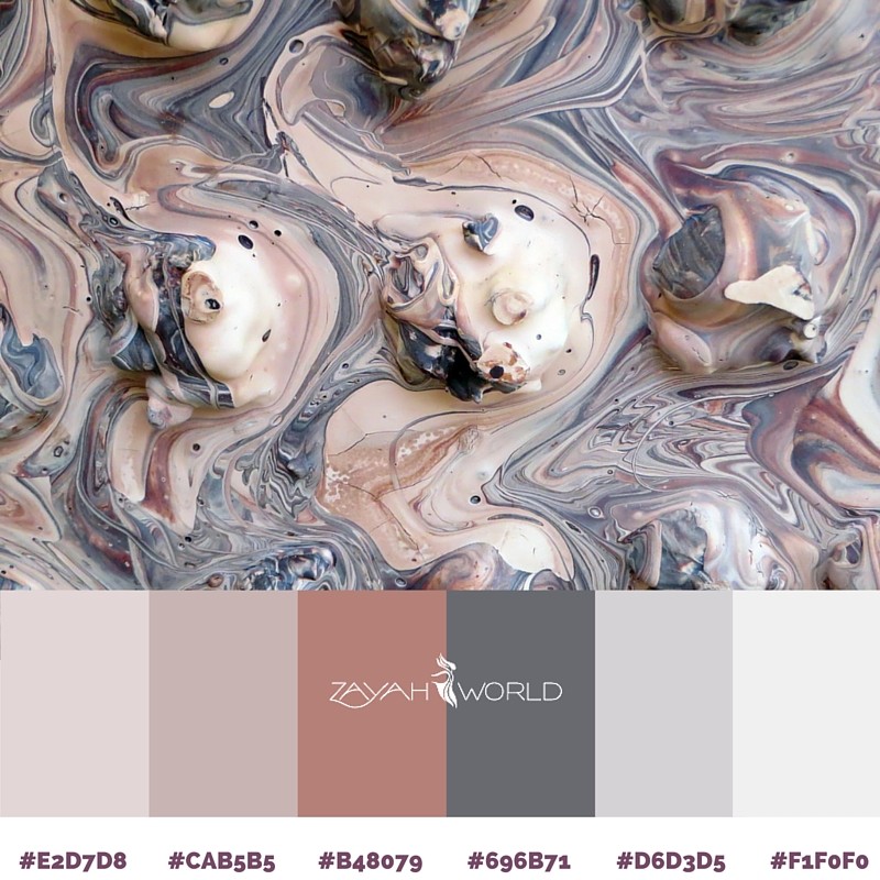
Palette 3: The Marbled Effect
Pastels are a gentle introduction into spring. This set, built around universally loved pinks and greys, is an elegant combination, enhanced with some deeper red tones hinting at the warmer weather to come.
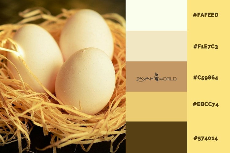
Palette 4: Nest Eggs
Birds are nesting and laying eggs in spring, so both the picture and the colour of golden yellow with some malt chocolate browns are a great reminder of the season.
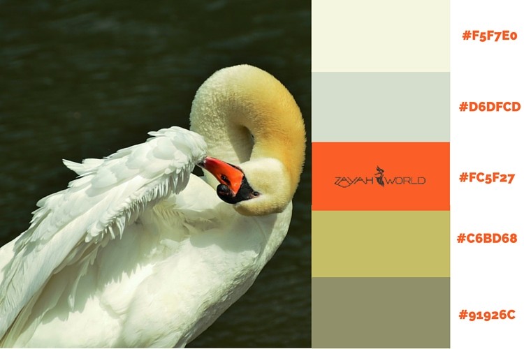
Palette 5: Swan Lake
Walks in the parks watching birds on lakes - the whites and muted yellow feathers and bright beak make the swan a beautiful bird. The orange is a hook to the season ahead while the grey the season just past.
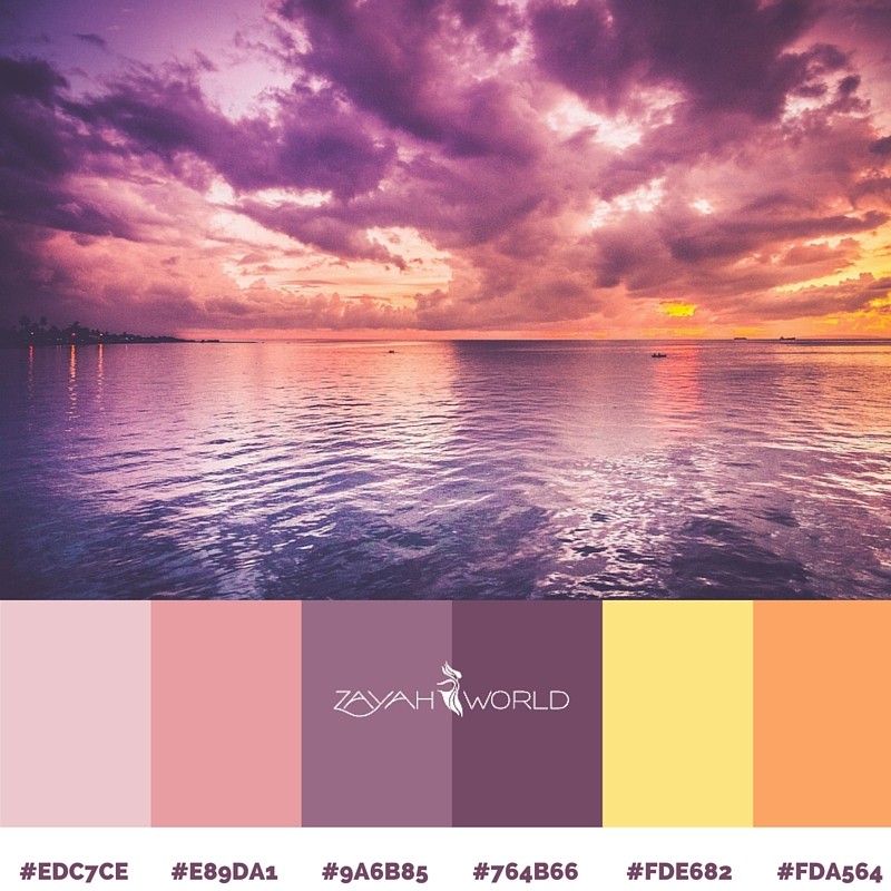
Palette 6: Purple Skies
Not your everyday version of the sky, but yellows and salmon colours team well with shades of purple - from the light and fresh to the darker. Replace the yellow with gold for a touch of royalty.
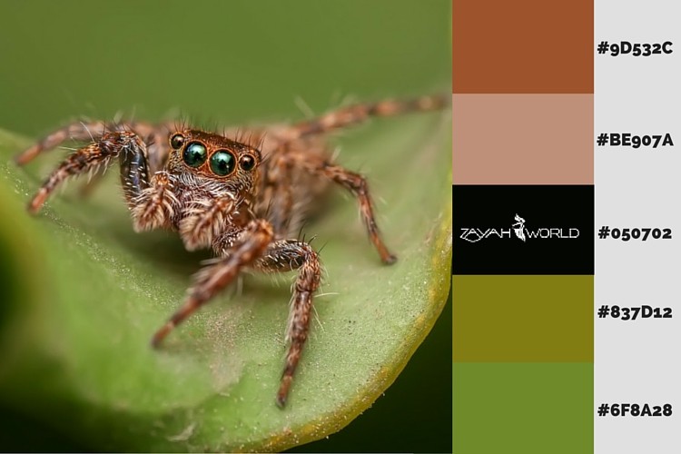
Palette 7: Bright Eyed
Greens are what Spring is all about, and teamed with terracotta this is a reminder of the time of year when we start seeing all kinds of creatures out and about.
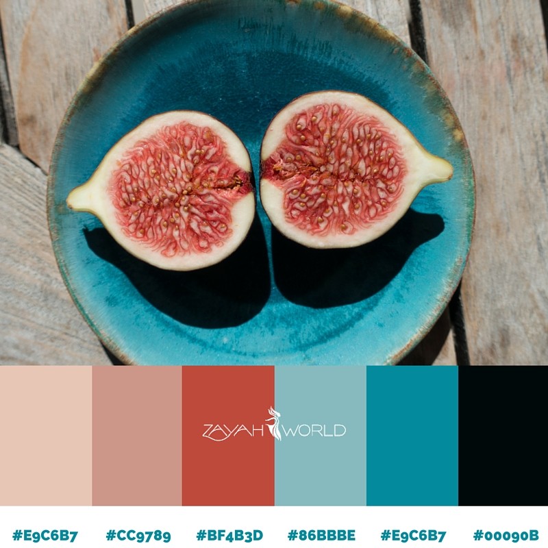
Palette 8: Breakfast Figs
Pinks & blues are often teamed up. This a grown up form of the classic pink and blue combination, with added black helping to create a pleasing, more "grown up" effect rather than a sense of childhood sweets.
Palette 9: The Bright Arch
The Spring sunshine creates a different shade of blue sky, usually with fleck of grey from the clouds. This palette plays with those blues and greys to create a brighter feel.
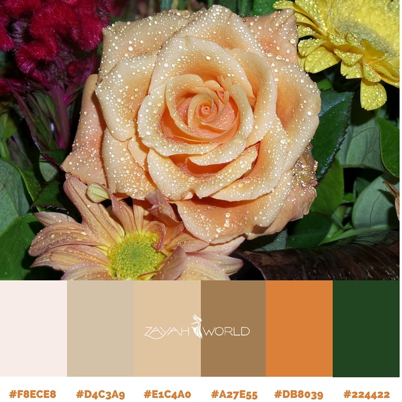
10. The Perfect Rose
While roses usually inspire red palettes, we've favoured a muted burnt orange accented by the dark green of fresh growth. It's a variation on a classic orange, brown and green combination.
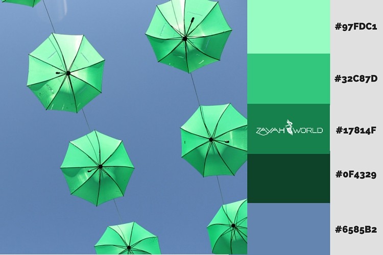
Palette 11: The Joy of Flight
Blue skies, trees full of leaves, birds everywhere preparing for the birth of their young, a sense of optimism and new life. These shades of green and blue capture the sense of vitality above us and all around.
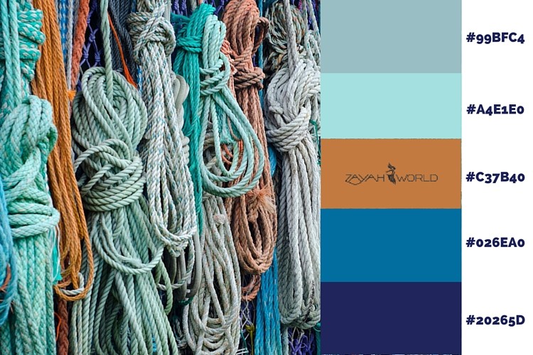
Palette 12: A Ropey Situation
Springtime is also about getting onto the water for those who love boats. This combination of blues is inspired by the water rather than sky.
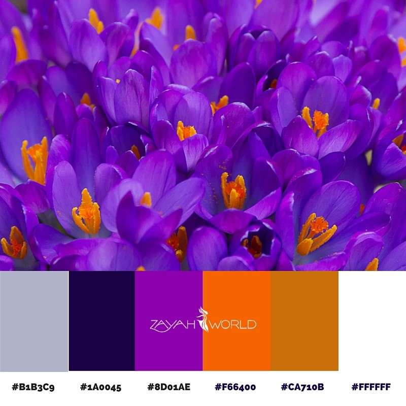
Palette 13: Crocus Blooms
We couldn't do Spring palettes without Spring flowers, and crocuses possess some of the most beautiful colours. The purple and orange is a stunning combination, and by playing with the amounts, balanced by the two other shades, you can create completely different moods, including bold and pretty.
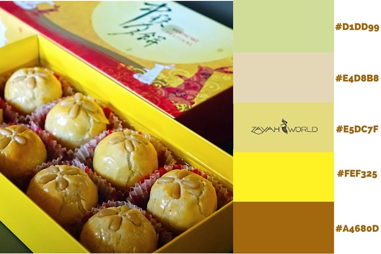
Palette 14: A Moon Cake For You?
Our Mooncake-inspired palette brings out a different set of yellows to the typical Spring shades. We think it's a little more distinctive than what you might usually find at this time of year.
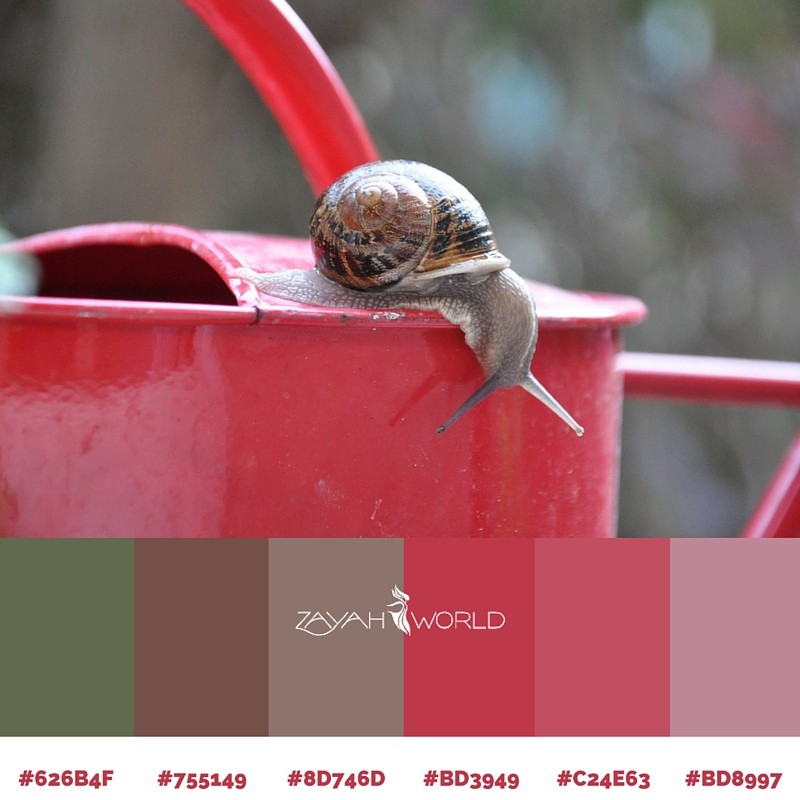
Palette 15: The Inquisitive Snail
The main element in this picture is the watering can, but the snail is what makes it an intriguing image rather than just a close up of a garden item. Which is kind of what colour palettes are all about.
Using Spring Colour Palettes
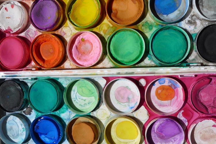
Thinking about how to use our Spring colour palettes can be confusing at first. There's more than one set of "rules" you might have heard about how colours are made up, and they aren't consistent with each other. For example, red, blue and yellow are used to mix paints, but red, green and blue electronic "dots" create all the colours on a TV screen. You may also have heard of colour palettes being "analogous", "complementary" or even "triad".
We're not going to get into these differences or theories here. We'll write about them another time, but if you want to read more in the meantime, we've suggested a few places below. Instead, we have a few thoughts to help pick and use our spring colour palettes in practice, even if you're not sure of the theory.
Don't Use Too Many Colours, 3-4 Is Enough
Firstly we'd suggest you don't use all the colours in any of our Spring colour palettes unless there's enough space for each colour to be seen - for example a large room when all the colours can be used, even if only as little flashes. Otherwise, it's usually better to restrict yourself to 3 or perhaps 4 of your favourite colours from one of the spring colour palettes that appeals most, and only work with them.
Be Aware of How a Colour Makes You Feel
In terms of selecting the right 3 or 4, our advice is to use your judgement by simply looking at what you're considering, and paying attention to how they make you feel. We've found it best to think beforehand of the words you want to feel from the final result, for example happy, serious, elegant, moody.
Try Letting Different Colours Take the Lead
You'll find that a set of 3-4 of the colours we've provided in each of our spring colour palettes will help you get to that mood. For instance, on Swan Lake if you picked out the orange for the majority of what you're creating, it's going to be eye catching! Now picture a dress in one of the more neutral colours on the palette with an orange scarf - the effect with some black jewellery will be stylish, but subtler.
Don't Make Decisions Based on Colour Swatches
Finally, wherever possible, don't choose colours by only looking at spring colour palettes in the form of colour swatches. Instead, pick real items of the colours which you can to look at in combination. For example, tester pots of paint on a wall at home rather than relying on the labels on paint tins in the shop.
More Help on Using Spring Colour Palettes
If you fancy reading something about combining colours, here are some good starting points:
The Basics of Colour Theory
Here's a great Youtube video that explains the basics of colour theory.
The US Government has published a useful guide to the basic concepts of colour theory, including the different ways of defining a colour e.g. RGB, CMYK etc
Using Accent Colours in the Home
The BBC has published this useful piece on interiors, and this link takes you straight to a useful section on how to use accent colours when looking at colours in the home
Colour Theory for Your Wardrobe
The folks at Lifehacker.com have looked at colour theory in the context of personal style.
Colour and Emotions
Here's some interesting reading on the psychology of colour
How You See Colour
Sometimes our choice of colours is limited by the medium we're using - for example paints can show far more subtle variations than a computer screen. But ultimately we're limited to what the eye is capable of discerning. It's worth taking a look at this article on how many colours the human eye can see.
Found this useful? Don't forget to share it!