

Is multicolour jewellery tough to wear?
When we first set out to make jewellery, we only felt it natural to combine colours we love into individual pieces, just like we do with clothes. We were surprised when we saw that many of our customers seemed uncertain about choosing pieces with several colours in them, and so delved deeper to try to understand why.
Once we got to the bottom of it, we changed the way we displayed our pieces, and also how we helped our customers make their choices. The result was that multicoloured pieces became increasingly popular, and we found ourselves straying into the world of helping women choose colours for their overall look, not just their jewellery
Jewellery designs are often monochrome
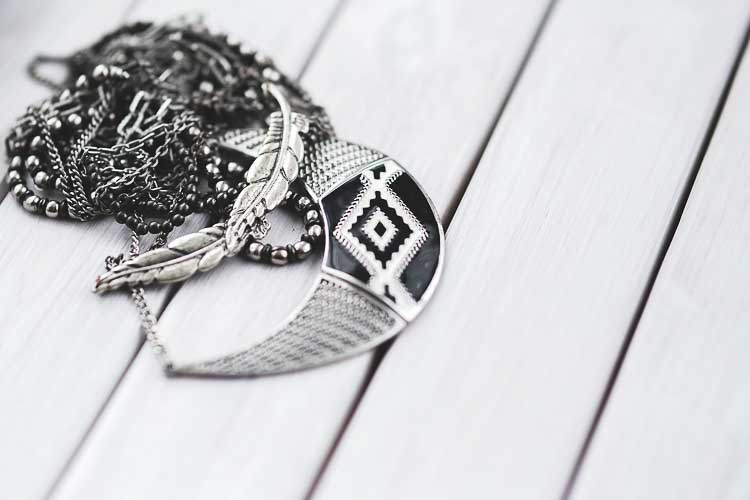 Much of the popular jewellery is monochrome or a single colour combined with a metal.
Many jewellery designers are very familiar and comfortable with this approach, not least because their customers are. This reflects how many women choose jewellery to be the same colour of a blouse, dress or jacket.
 When we asked why they did that, the first reaction was a sort of head-scratching, puzzlement . . . like “Isn’t that just what you’re meant to do?” So the first surprise was that our multi-coloured pieces were seen as unconventional by some, so not for them!
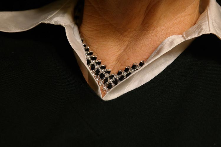
Multi-coloured doesn’t have to look bold
Once we started showing those pieces off against different backgrounds, from solid colours through different patterns and textures and varied shapes, it seemed to open a few eyes to the fact that multicolour jewellery doesn’t have to create a bold look.
Not just that, but we found people discovering for themselves that adding little splashes of multicolour jewellery can have a big impact on a familiar piece of clothing or look.
Some Useful Concepts for Combining Colours
The theories behind how we perceive different colour combinations can be complex, but underpinning them are a handful of concepts which we found helped us get to grips with the subject. Just like when choosing paint to decorate a room, three of the models are particularly useful – although the more graphically literate have a few other options we’ll explore another time when we’re talking about design.
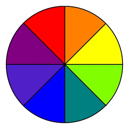
1. Harmonising colours
A colour harmony is something that is visually pleasing to the eye and can be created by taking a colour that falls next to the main hue of the jewellery on the colour wheel .
2. Tint, Shade or Tone colours
Harmonising colours can also be created by either choosing a colour that is a tint, shade or tone away from the main jewellery colour.
3.Comple mentary colours
For a complementary colour scheme, choose the hue that is directly opposite on the colour wheel.
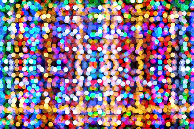
Illustrating the point
Parting shot
Why not look at a range of colour palettes here to give you some ideas? Experiment and have fun – you can wear multicolour jewellery as easily as you’ve been wearing your platinum, gold or silver. If it works for you, it’s your style!